

DeLonghi F28533
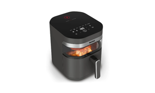
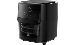
DeLonghi F28533 to wysokiej klasy frytkownica dla osób, które pragną bardzo szybko i wygodnie przygotowywać pyszne frytki. Produkt cechuje się wysoką funkcjonalnością oraz trwałością.









OPIS DeLonghi F28533
DeLonghi F28533 dane techniczne: Stopnie regulacji temperatury bezstopniowy Pojemność żywności (kg) 1,0 Pojemność oleju (Litry) 1,1 Moc znamionowa (W) 1.800 Lampka kontrolowa zasilania tak Termoizolowana obudowa tak Tiefkühlstufe nie Okienko poglądu tak blokada pokrywki tak zbiornik tłuszczu nie Możliwość mycia filtra w zmywarce tak obsługa kosza od zewnątrz tak Informacje ogólne Kolor biały Szerokość (mm) 310 Wysokość (mm) 240 Głębokość (mm) 360
OPINIE O DeLonghi F28533
-
Jan Kowalski
napisał(a) 2 dni, 14 godzin temu:
A colleague asked me to help organise questions for a training provider. Several course titles sound similar, but I do not want to assume they are intended for the same applicant. We need a short enquiry that describes the colleague’s situation clearly enough for the provider to explain whether its course is relevant. The intended credential should be explicit. The state belongs in the enquiry. Prior experience needs an accurate description. My background reading began with <a href=https://realestatelicenseguide.top>broker license</a> and raised several questions worth checking directly. A title leaves important questions unanswered. Entry requirements need direct confirmation. I would ask for supporting references. The replies should support a later comparison. I would avoid asking the provider to infer eligibility from a vague job title. Before anyone relies on the reply, the current official requirements also need checking. The immediate goal is a useful conversation about the course’s audience, not a decision based on similarities between product names. What fields would make enquiries clearer?
-
Jan Kowalski
napisał(a) 1 tydzień temu:
With more presentations taking place online, I have begun paying attention to the tops I wear during work calls. Some shirts look perfectly ordinary in person but become surprisingly prominent against the light wall in my camera view. I am not trying to look formally dressed every day; I mainly want my face to remain easy to see. Keeping the room setup unchanged should let me compare several solid-colored tops without confusing clothing differences with lighting changes. I found a page about <a href=https://outfit-style.top>color analysis</a> and would like to use the idea as a starting point for these comparisons. Small stripes are already on my avoid list because they look restless in the preview, even when the fit is good. Is a brief recording a better comparison than watching the live preview, especially when deciding between similar shirt colors? Another uncertainty is whether I should prioritize the color near my face or its relationship with the room background. If you present online regularly, I would appreciate the checks you use before settling on your usual camera clothes.
-
Jan Kowalski
napisał(a) 1 tydzień temu:
I am learning to sew and want to choose fabric for a first blouse that I will actually wear regularly. Construction is not the problem at this stage; comparing shades from photographs is the part that keeps delaying me. I can order small swatches first, which seems more sensible than paying for enough fabric for several trial garments. One idea I am exploring before ordering the samples is <a href=https://seasonalcoloranalysis.top>personal color analysis</a> though I still want the final choice to work with the clothes I already enjoy wearing. Should a small swatch selection stay close to one color family, or include a contrasting sample for comparison? The samples will only be small squares, so I need to account for the larger area of the finished garment. How do other home sewers balance palette advice, fabric availability, and the practical need to match existing trousers or skirts?
-
Jan Kowalski
napisał(a) 1 tydzień, 4 dni temu:
Our community theatre needs a bobbed wig for a character, but the reference folder mixes several lengths. The costume sketch has a blunt outline. I am trying to separate the overall shape from the styling in each picture before we choose anything. Some references end at the jaw. <a href=https://hairstylesimulator.top>bob haircut lengths</a> could be a useful starting point for comparing proportions, although a preview cannot tell us how a wig will move. There is a fast entrance in the second scene. The headset needs space around the ears. I would like to take a short list into rehearsal instead of asking everyone to choose from dozens of unrelated pictures. Would you start with the profile and neckline? A small set of comparison points would be useful. We can check the fit before cutting anything. What should go on our rehearsal fitting notes?
-
Jan Kowalski
napisał(a) 2 tygodnie, 3 dni temu:
When describing a portrait aloud, is a face outline category actually useful? I am preparing brief audio descriptions for a small local portrait exhibition. The current draft describes posture and expression before mentioning the outline of the face. My terminology notes include a resource about <a href=https://findmyfaceshape.top>face shapes</a> but a category alone may communicate less than a concrete description of proportions. The script needs to remain concise without implying that an outline reveals personality or character. The wording should separate visible details in the portrait from the writer’s interpretation. The final recording will be heard without the accompanying written notes, so each term needs to earn its place. I would ask a listener to explain what they pictured after hearing the sentence, then revise any wording that created a more specific impression than the portrait supports. What editing test would help identify a label that listeners can comfortably do without?
Instrukcja obsługi do DeLonghi F28533
- Instrukcja obsługi do DeLonghi F28533
Pobierz instrukcję PDF w języku: PL
Ilość pobrań: 0 - Instrukcja obsługi do DeLonghi F28533
Pobierz instrukcję PDF w języku: PL
Ilość pobrań: 0

Powyższe instrukcje są jedynymi w wersji elektronicznej, które dostarczane są przez producenta. Jeżeli nie pomagają Ci one w rozwiązaniu problemu, możesz skorzystać z naszej pomocy na naszej grupie na Facebooku - Testerzy VideoTestów.



Oceń DeLonghi F28533
-
Jan Kowalski
napisał(a) 2 dni, 14 godzin temu:
A colleague asked me to help organise questions for a training provider. Several course titles sound similar, but I do not want to assume they are intended for the same applicant. We need a short enquiry that describes the colleague’s situation clearly enough for the provider to explain whether its course is relevant. The intended credential should be explicit. The state belongs in the enquiry. Prior experience needs an accurate description. My background reading began with <a href=https://realestatelicenseguide.top>broker license</a> and raised several questions worth checking directly. A title leaves important questions unanswered. Entry requirements need direct confirmation. I would ask for supporting references. The replies should support a later comparison. I would avoid asking the provider to infer eligibility from a vague job title. Before anyone relies on the reply, the current official requirements also need checking. The immediate goal is a useful conversation about the course’s audience, not a decision based on similarities between product names. What fields would make enquiries clearer?
-
Jan Kowalski
napisał(a) 1 tydzień temu:
With more presentations taking place online, I have begun paying attention to the tops I wear during work calls. Some shirts look perfectly ordinary in person but become surprisingly prominent against the light wall in my camera view. I am not trying to look formally dressed every day; I mainly want my face to remain easy to see. Keeping the room setup unchanged should let me compare several solid-colored tops without confusing clothing differences with lighting changes. I found a page about <a href=https://outfit-style.top>color analysis</a> and would like to use the idea as a starting point for these comparisons. Small stripes are already on my avoid list because they look restless in the preview, even when the fit is good. Is a brief recording a better comparison than watching the live preview, especially when deciding between similar shirt colors? Another uncertainty is whether I should prioritize the color near my face or its relationship with the room background. If you present online regularly, I would appreciate the checks you use before settling on your usual camera clothes.
-
Jan Kowalski
napisał(a) 1 tydzień temu:
I am learning to sew and want to choose fabric for a first blouse that I will actually wear regularly. Construction is not the problem at this stage; comparing shades from photographs is the part that keeps delaying me. I can order small swatches first, which seems more sensible than paying for enough fabric for several trial garments. One idea I am exploring before ordering the samples is <a href=https://seasonalcoloranalysis.top>personal color analysis</a> though I still want the final choice to work with the clothes I already enjoy wearing. Should a small swatch selection stay close to one color family, or include a contrasting sample for comparison? The samples will only be small squares, so I need to account for the larger area of the finished garment. How do other home sewers balance palette advice, fabric availability, and the practical need to match existing trousers or skirts?
-
Jan Kowalski
napisał(a) 1 tydzień, 4 dni temu:
Our community theatre needs a bobbed wig for a character, but the reference folder mixes several lengths. The costume sketch has a blunt outline. I am trying to separate the overall shape from the styling in each picture before we choose anything. Some references end at the jaw. <a href=https://hairstylesimulator.top>bob haircut lengths</a> could be a useful starting point for comparing proportions, although a preview cannot tell us how a wig will move. There is a fast entrance in the second scene. The headset needs space around the ears. I would like to take a short list into rehearsal instead of asking everyone to choose from dozens of unrelated pictures. Would you start with the profile and neckline? A small set of comparison points would be useful. We can check the fit before cutting anything. What should go on our rehearsal fitting notes?
-
Jan Kowalski
napisał(a) 2 tygodnie, 3 dni temu:
When describing a portrait aloud, is a face outline category actually useful? I am preparing brief audio descriptions for a small local portrait exhibition. The current draft describes posture and expression before mentioning the outline of the face. My terminology notes include a resource about <a href=https://findmyfaceshape.top>face shapes</a> but a category alone may communicate less than a concrete description of proportions. The script needs to remain concise without implying that an outline reveals personality or character. The wording should separate visible details in the portrait from the writer’s interpretation. The final recording will be heard without the accompanying written notes, so each term needs to earn its place. I would ask a listener to explain what they pictured after hearing the sentence, then revise any wording that created a more specific impression than the portrait supports. What editing test would help identify a label that listeners can comfortably do without?
-
Jan Kowalski
napisał(a) 2 tygodnie, 3 dni temu:
Our small illustration group is putting together a glossary, and the section about face outlines needs a clearer editorial approach. Some entries offer only a category name, while others mix several visible features into paragraphs that are difficult to compare. A reference about <a href=https://squarefaceshape.top>determining face shape</a> might help us decide which observations belong in each entry. I would like every definition to follow the same order, moving from overall length and width to the outline of the jaw. A shared structure might make comparisons easier without suggesting that one feature always determines the category on its own. We also need a short note explaining that intermediate outlines can be described without inventing a new category for each example. For the diagrams, I would use simple line drawings at the same scale and leave hairstyle details out of the comparison. We want neutral descriptions that support observation, without presenting a particular outline as the standard that every portrait should follow. Which details are essential in a beginner glossary, and which would you move into a separate explanation with more examples?
-
John Doe
napisał(a) 11 miesięcy temu:
Здорово! По твоей ситуации с гулом от арок — классика. По опыту в 80% случаев причина не только в арках снаружи, а в полости за локером плюс «мостики» шума через точки крепления. Проверяется просто: на ходу слушаешь, меняется ли характер гула при повороте — если меняется, значит резонирует кузовщина.
Алгоритм следующий: снимаешь локер, обезжириваешь поверхность, клеишь вибродемпфер с хорошим КМП и обязательно прикатываешь роликом для адгезии. Поверх — слой шумоизолятора, желательно с закрытой ячейкой, иначе наберёт воду. Детальнее по технологии для шумоизоляции можно глянуть тут: <a href=https://shumoizolyaciya-avtomobilej.ru>шумоизоляция автомобилей</a>.
По эффекту: ожидай уменьшение шума примерно вдвое, точные цифры определяются состояния кузова. Главное — не халтурь с прижимом, а то отвалится к весне.
Pytania i odpowiedzi
Nie ma jeszcze żadnych pytań. Możesz być pierwszy.